
Introduction
We usually think of time as flowing linearly, so it seem natural to place events along a timeline, but this form of representaion is just 250 years old, with temporal information previously being recorded as annals and chronologies (Rosenberg and Grafton 2010). Categorical data located along a single temporal axis is a ‘timeline’ whereas a plot of quantitative data is a ‘time series’. Things also occilate or cycle though time driven by planetary movement and their own internal processes.
Annals and chronicals
Before the timeline temporal records were organised into ‘annals’ (event date lists) and narrated chronologies, with modern historical study emerging with modernity (idib.), to which may be added commercially and govenmental records.

Information in such records is often scant and contradictory, for example Goodchild (2007) identified just four reported cereal yeilds ranging from 8:1 to 100:1 for The Middle Tiber Valley, Italy, during the Roman period.
Timeline
A timeline locates point and duration events along a temporal line.


Long timelines require a long page or may be wrapped across a page to fit.


Spiralling proves an alternative means of fitting a long timeline in a restricted space. Here, ‘deep’ geological time has been log-scaled and displayed as a spiral. The log scale works because we have less information about the past. Spiral thickess increases with information growth though time.

Timelines may also be linked into ‘streams’ or ‘rivers’.

A genealogy is a reticlate timeline network.

Time series
Time series plot quantitative values against a temporal axis with records. The global average temprature record over the last 540 million years shows the types of pattern that time series may contain, including peaks, toughs, isolated spikes, trends and oscillations (cycles), and how climate change involves both trends and cycles. It is a composite time series synthesised from a range of data sources in which temporal resolution decreases with age. The ‘Climategate’ controversy is a salient reminder of the importance of openess and considered language when synthesising temporal or other data from multiple sources.

Time series plotted on the same axis facilitate comparison, however readability declines as the greater number of time series and overlap increase. Plotting eleven supermarket time-series on a single plot just about works as series overlap is not high, but some of the series in the low group are difficult to trace, particularly Lidl.

Plotting as stacked an area graph visually seperates series, but the y-axis is scaled to the maximum sum of all values, which reduces vertical variation within series and prevents the simple reading of the value for a store in a year. In this case, the loss of vertical variation significantly impacts the utlity of the plot.

Contast the total store area to the plot of new store area in which series vary within a similar range and cross more frequently. In this case an area-plot is more approriate.


Line and area plots reveal cyclic/occilatory behaviour as periodic rise and fall in value. Occilations may be extrenally directly or indirectly driven by variation in energy reaching the earth resulting from its tilt, and rotation around its axis (daily cycle) and the sun (annual cycle), as well as longer Milankovitch cycles that stem from orbital eccentricites.


Cycles may also result from the internal working of earth and biological systems, for example, the El Niño-Southern Oscillation and predator-prey interactions. Phenomena may be subject to more than one cyclic driver; for example, a predator-prey cycle may be modulated by the El Niño-Southern Oscillation.


A dated evolutionary tree might be thought of as a hierarchical timeline, as ‘diversification’ is a qualitative event that divides an ancestor into isolated descendants. Nodes and branches, however, are often symbolized to show quantitative values, making it both a timeline and a series network. Here a tree is displayed radially with the time increasing from the common ancestor in the center to living taxa around the circle.

The display of both qualitative and quantitative data against the same timeline is not unusual, so the distinction between lines and series is false; nevertheless, most linear temporal visualization may be assigned to one of these categories.
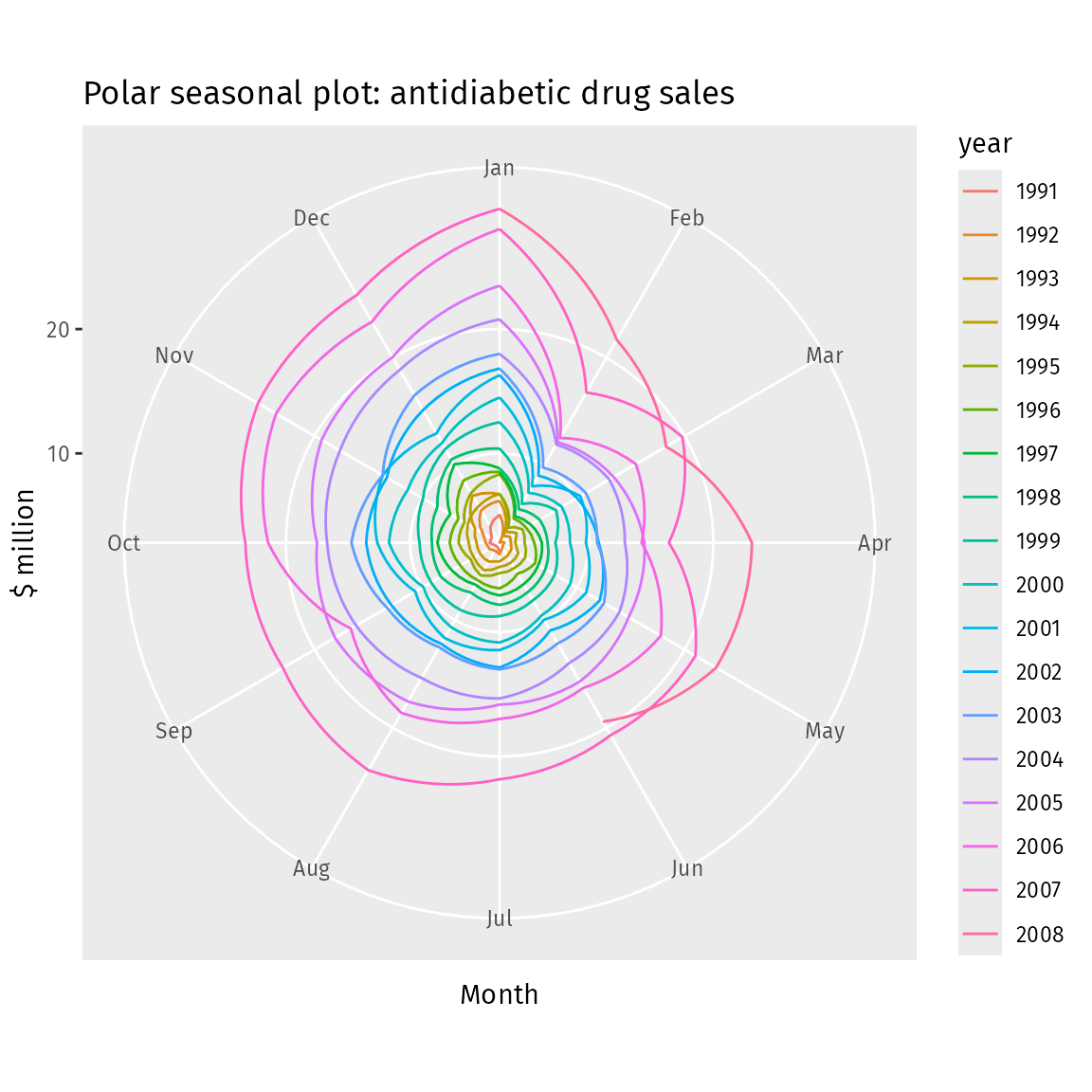
Radial time
Radial plots show patterns within a cycle or average patterns across cycles, for example, the number of road accidents each hour in a day.

The NASA climate spiral visualization animation show increasing global warming through time as a radial plot, before changing viewpoint to reveal it is actually 3D time-spiral.
References
Goodchild, H. (2007). Modelling Roman Agricultural Production in the Middle Tiber Valley, Central Italy. PhD Thesis, Institute of Archaeology and Antiquity School of Historical Studies, The University of Birmingham. https://etheses.bham.ac.uk/id/eprint/175/1/Goodchild07PhD.pdf
Rosenberg, G. and Grafton, A. (2010). Cartographies of Time. Princeton Architectural Press, New York.