
High-level design
High-level design decisions relate to the
Aesthetics
The ‘aesthetic’ of a design is its ‘style’, and style influences viewer emotional response as well as the comprehension of infomation from the graphic.
Substantive design
Data graphic design may be partitioned into its ‘substantive’ and ‘affective’ components.

The substantive design of a graphic is the information that must be communicated, whereas the affective design is ’emotional embellishment’, for example, the portrail of ‘monsterous cost’ figures as the teeth in a monster’s mouth. Such embellishment may be characterised as chart junk (Tufte 2001, p?) that detracts from the ‘optimal’ clear minimal presentation of quantitative data, but it has also been demonstrated to improve attention and recall (ref). Defining the line bwteen what is ‘junk’ and what is not is also problematic().
Tufte’s concept of the ‘data-ink ratio’, the amount of data divided by the amount of ‘ink’ used to display it, as a measure of graphic quality is aligned with substantive design and the removal of chart junk. Lower ink-density ratios indicate minimalistic substantive design, whereas high ratios suggest unessessary graphic embellishment, for example, excessive grid lines and backgound shading. Very low data-ink density designs may, however, be so ink depleated that they lack visual presence/weight on the page.

Chart junk and the ink-data ratio are useful ways of thinking about graphic presentation especially in scientific and technical reports, but may be less important or indeed beneficial when communicating to a range of stakeholders or the general public.
Substantive and affective design are contrasts along an aesthetic dimension from ‘plain’, flat, minimalist scientific and technical design to more elaborate free-form and artistic designs. For example compare Palyfair’s 1786 Chart of all the import and exports to and from England from the year 1700 to 1782 to a modern equivalent published by HM Revenue and Customs.


The modern graph has a has a lower ink-data ratio, eliminates uncessarily shading, avoids conflict between data and labels, has minimal grid lines, and uses a more accessible a san serif font, but in doing so has lost the ‘softness and warmth’ of Playfair’s graph. Which would you hang on your wall? These graphs are both examples of formal scientific design with the purpose of primary purpose of communicating quantitate data, but they also a demonstate that all design is conditioned by culture and positioned in place and time.
Affective design
Affective design is the overall ‘look’ or ‘aesthetic’ of a design, of which substantive design is but one. They differ, however, in substantive design having a single unified purpose (the effective communication of information) and formal means of determining how well designs meet this aim (scientific evaluation). Other aesthetics may be inspired by science, but only substantive design is scientific. Maps from the age of discovery are surrounded by pictures of conqured and heathen lands exhorting the power of nations and their rulers, an approach to bolster national pride and attract international interest. In pictorial maps, stories are told by pictures within the map rather than surrounding it.


Substantive-affective continuum
From a scientific perspective, substantive design is substantively different from other aesthetics as it is based on scientific principles, although the artisitic component is also recognised. This difference means data graphics exist along a continuum from ‘primarily substantive’ to ‘primarily affective’ that often correlates with reduced ‘regulation’ by adherence to the principles of substantive design

‘High-level’ design is concerned with ‘whole’ graphics on contrast to the ‘low-level marks’ of which they are composed. High-level design principles apply to both the composition of individual figures and their associated graphic elements, and, the composition of figures and thier graphic elements with additional graphic elements not directly associated witha figure in ‘layout space’.
High-level design is considered under four headings:
- Visualisation approaches
- Aethetics
- Figure-level design
- Consistency
Visualisation approaches
Perhaps, the most fundamental design decision is what visualisation approach, or approaches, should be employed to to meet the purpose and if the designer does not have a clear missive then resulting graphic may not be approriate. It may be possible to meet needs using single graphic (map, graph, digram, or table), but more the complex needs and data the more difficult this becomes. Space is limited and infromation density high. While it is possible to capture multiple dimensions in a single graphic this takes skill and effort, and in any case it is often better to show multiple different simpler views than to overload a single graphic reducing its legability.
Graphs
Many alternative approaches may be taken to visualise data, for example various types of 2D graph. There are many online resources that decision trees and other materials help guide the selection of approptiate graphic approaches but none are comprehensive, nevertheless, they introduce the palette of graph approaches available and how they may be used.
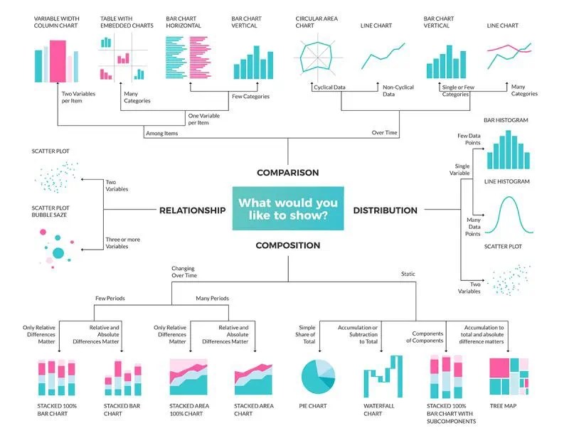
2D graphs are just one of the types of visualisation approach that may be employed, for example, 3D graphs add a third orthognal dimension, maps show distributions in geographic space, ‘scenes’ provide realistic views of 3-dimensional ‘-scapes’, and animation may be used to show change, while networks diagram may be used to illustrate connectivity between concepts, and analytical processes and results. Considerable variation exists within all these approaches.
Maps
Maps are graphs in which the x and y axes are spatial dimensions that locate to the earth’s surface. Maps should only be used where spatial distribution matters. For example, if you have values for a few ‘known’ regions a graph or table may be a better at communicating absolute and relative values than a map. The the number of locations and spatial structure increases.


3D graphs and scenes
Three-dimensional plot can be very useful where data contains three-dimensional pattern, but 3D plots are actually 2D renderings of 3D spaces that use perspective to create an illusion of 3D. Perspective distorts graph axes (they are no longer orthognal), adds ambigiouly a single location on the page maps to multiple locations in graph space, and graphic marks obscure each other. Advantages of 3D geographic scenes include improved task performance, realism, and the ability to experience different worlds (Rzinoor et al. 2012; Judge and Harrie 2022), however, improvements are task-dependent and may be hyped (Juřík et al., 2020).


Consider whether alternative approaches might be employed before diving into 3D. It would be difficult, if not impossible, to communicate 3D building shape on a 2D map, but does the Moß N. J et al. figure really need to be 3D? Volumetric current density is both located on y-axis and symbolised withcolour. Plotting in 3D with a grid does however show the line of inflexion where values change which would likely be less prominent in a 2D plot.
Networks
Network diagrams are useful for encoding connections and flows, whether conceptual or empirical representations of the world. Data density and occlusion may result in a ‘hairball’ in which it is difficult to discern pattern.

High-level principles
Orientation
The shape of the ‘area of interest’ inflences layout orientation, for example maps of north-south elongated countries such as Great Britain and Japan are ‘portrait’, whereas landscape is more approriate for places east-west elongated counties, such as Indonesia or Russia. Graphics may be rotated so that data and pattern are orientated to the layout dimensions, but this put adds reader ‘congitive load’ as the figure must be mentally re-rotated to align.
Title or caption
All figures must have a descriptive title. The title of figures within a document (including academic posters) are part of the figure caption written, wherea as the title of figure intended as a ‘standalone’ graphic is part of the layout. Titles should be descriptive, but kept as short and snappy as practical. Do not title figures as ‘Map of…’. or ‘Scatter chart of…’ as the reader can see that themselves.

Acknowlegment
Acknowledging sources of data or graphic form is both an ethical requirement, while declaration of copyright is a legal requirement. Acknowledgements and copyright may be part of the figure (England’s Demonic Landscape) or caption (Trade-winds dynamics).
Framing
In cartography, the ‘framing’ is the region of geographical space displayed on a map, but the principle is also a more general principle, for example, 3D visualisations are framed from the viewpoint. Framing influences what is seen and how it is seen, including treatment of extreme values and the scale(s) at which data is visualised. In cartography, detail and overview maps are common approaches for locating geographical outliers and revealing pattern at more than one scale.

If a map shows the region surrounding a point of interest (POI) then it may seem sensible to locate the POI at the geometric center of the map, but placing the POI at the optical center may improve the framing balance as viewers naturally scan from upper left to lower right tracking through the optical center that lies above the geometric center.

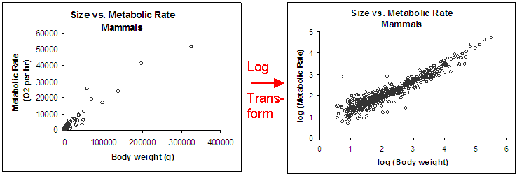
Log and other transformations may be appied to ‘frame’ non-spatial data axes.
Layout
The ‘layout’ is the page or screen space within which graphics and their accompanying ‘furniture’ (titles, legends, menus, etc.) are placed. The format, content, and design of the layout must be driven by use needs, for example, is it a figure in a publication, an academic poster, or data-driven web portal?


Layout design involves the sizing and juxtapositioning graphic elements (maps, graphs, titles, legends, scale bars, annotation, tool, menus, etc.) to maximise ease in use and understanding. All visualisation is limited by the size of the layout space that is specified by the deisgner (page/screen size) modulated by how the user views it, for example, an A4 map rescaled in printing to A3 or a web app designed to be viewed on a large screen being accessed from a mobile device. Some systems such as ArcGIS Online provide tools for porting visualisations to different devices.
Graphic elements on a layout should be appropriately shaped, sized with more important elements taking up proportionally more space, so the a north arrow, scale bar and legend of a map will usually be considerably smaller than the plot they relate to. Plots and their furniture should form a clear visual grouping unless furniture relates to multiple plots, for example plots share a common symbology, so only one legend is required. Elements should generally align.
Legability
‘Legibility’ is often considered in terms of symbols and text being be easily identified and understood in the context who is viewing the graphic (e.g. restricted vision or colourblind) and the context in which it will be viewed (e.g. paper/screen, viewing distance and conditions, etc), but this definition is extended here to encompass the ‘legability’ of whole graphics through the application of visual contrast and the consideration of visualisations that aim it to show pattern without the need to differentiate individual items.
The ‘classic’ definiton of legability is applicable to general-use topographic maps where the identification of specific features is primary, whereas a hurricaine model ensamble map exemplifies the presentation of pattern over individual features with the aim of communicating uncertainty. ‘Legbility’ of the hurricane map should be assessed in relation to its use context.


To be legable, symbols and text representing different things must be easily discernable from one another. For example, a circle is easier to visually differentiate from a triangle than a decagon.

Symbols and text overlap should be minimised, but in a data-driven graphic the positioning of feature graphics is determined by the data and not the designer, so overlap must be dealt with rather than excluded. Some graphics purposes may allow a degree of positioning license, as occurs in cartographic generalisation, but these are exceptions. What legability issues can you see in this student map?

Legability is compromised by:
- The proximity and orientation of place labels, compounded by a lack of context for their eclectic selection.
- The Kingston Area Action Plan area cannot be discerned and a space added to the legend text.
- Station symbols are small so must be actively searched for.
- Railway lines must be actively differentiated from background and chropleth map lines.
- The basemap is overlain by an opaque choropleth map.
- The basemap attribution is obscured by the underlying basemap.
Legability is context-dependent, with both the viewer and viewing conditions influencing legability. Viewing distance impacts is important for poster design so check symbols are approriately sized for the intended viewing distance.
| Viewing Distance (meters) | Approximate minimum size for legability of point symbols (millimeters) |
| 0.5 | 0.3 |
| 2 | 1.15 |
| 5 | 2.9 |
| 10 | 5.8 |
| 15 | 8.7 |
| 20 | 11.6 |
| 25 | 14.5 |
| 30 | 17.4 |
Conventions and standards
Using established consistenty employed graphic motifs and symbols helps legability through familiarity, with symbol design having been refined through practical use or formal design process. While established symbologies may be useful, or indeed required, they are also restictive, limiting graphic options. When designing a data graphic you must decide whether to adhere to a standard, adopt/adapt a convention, or design a custom symbology.The BGS C artographic standard geological symbol index and the BGS Geology 50k (DiGMapGB-50) colours look-up table are examples of an internal design standards.

Contrast the BGS map with one published by the Kent Geological Group that illlustrates community adopted graphic tropes including similar colours to those of the BGS with the exception of the Thanet beds that do not stand out particularly well on the BGS map and the textures commonly used for type of rock, dots for sandstone varying in size and density with particle size, blocks for chalk, and lines and untextured symbology for clays and units with strong bedding.

Balance
Balance is the distribution of visual weight across the page (Lauer and Pentak 2000), which in respect of maps is “the organization of map elements and empty space that results in visual harmony and equilibrium” (Slocum et al. 2009). All figures will contain empty space between graphic elements, but avoid blocks or areas of ‘dead empty space’ that unbalance the overall design.

Consistency
When layouts are composed of multiple elements it is good practice to employ a shared symbolic language accross all elemenets unless this significantly detracts from the message intended from an element. Here I employ the same colour encoding for different classes of things that memorialise the 19th Century Prussian scientist and explorer Alexander von Humboldt for a stack of stacked time series, an area plot, and a map.

Visual contrast
Visual contrast is the means by which symbol and text categories are made discernible from each other and background information. High contrast may be used to draw the viewer’s attention to important features or pattern, for example red to highlight a route against a low-contrast basemap.

Insufficent contrast hinder legabilty as graphic elements are less distinct from another resulting in an aesthetically ‘bland’ graphic, while high contrast across an entire graphic may be too brigh and garish, and cause the eye to jump between different figure-ground configurations.

The mind unconsciously partitions images into prominent figure (foreground) and less distinct ground (background). The designer decides which features should be in the foreground and which in the backgound. High contrast graphics are intepreted as figure and low contrast graphics as ground. Here, European Union countries symbolised in dark blue is the ‘figure’ while other countries, lakes and the sea are ‘ground’.

Figure-ground differentiation is a binary subconsious action, however, the viewer may also consciously focus attention on features that have a similar level of contrast, colour, or other visually defining attribute. Symbol may be designed to create a visual hierarchy within a graphic that maps to the ‘importance’ of each information category.

References
Juřík V, Herman L, Snopková D, Galang AJ, Stachoň Z, Chmelík J, et al. (2020) The 3D hype: Evaluating the potential of real 3D visualization in geo-related applications. PLoS ONE, 15(5): e0233353. https://doi.org/10.1371/journal.pone.0233353
Judge, S., Harrie, L. (2020). ‘Visualizing a Possible Future: Map Guidelines for a 3D Detailed Development Plan. Journal of Geovisualisation and Spatial Analysis, 4(7). https://doi.org/10.1007/s41651-020-00049-4
Lauer, D. A., & Pentak, S. (2000). Design Basics (5th ed.). Fort Worth, TX: Harcourt Brace & Company.
Ruzinoor, C. M. et al. (2012) ‘A review on 3D terrain visualization of GIS data: techniques and software’, Geo-spatial Information Science, 15(2), pp. 105–115. doi: 10.1080/10095020.2012.714101.
Slocum, Terry & McMaster, Robert & Kessler, Fritz & Howard, Hugh. (1999). Thematic Cartography and Geographic Visualization, 1st Edition.